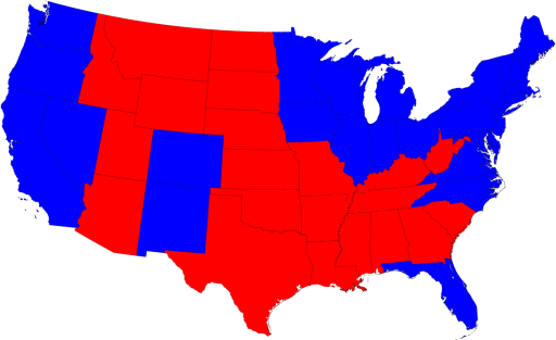
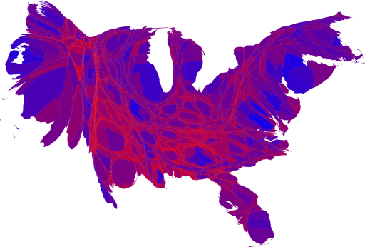
But a better visualization would shade the areas based not upon who won the state, but by the degree to which they won the state. And the states themselves shouldn't be represented as a function of their geographic size, but rather the size of their population. Here we have just such a picture, and its clear, we are all purple now. More can be found here.
1 comment:
This is an excellent post. Fascinating to NOT have something presented as black or white. Having come from a "ruby red" state (as Katie Couric called it) I was fascinated by this electoral tidbit: "For the first time ever, a blue circle will appear in Nebraska on national electoral maps.
Democrat Barack Obama won the Omaha-based 2nd Congressional District on Friday, scooping up one of the state's five electoral votes.
In the process, he made history and shone the spotlight on Nebraska's unusual electoral college system.. . . Nebraska is the first state in the modern era to have a split electoral decision."
Post a Comment